Boston New Technology

Improving information discovery and

Improving information discovery and user engagement for all BNT visitors.

Improving information discovery and user engagement for all BNT visitors.

Improving information discovery and

user engagement for all BNT visitors.

user engagement for all BNT visitors.

BACKGROUND
BACKGROUND
BACKGROUND
BACKGROUND
I joined the Boston New Technology (BNT) team during a period when the initial designers were on leave, and I played a critical role in bringing our new website to life under the guidance of the leadership team. The foundation was laid out in detail, which greatly helped in understanding the tasks at hand.

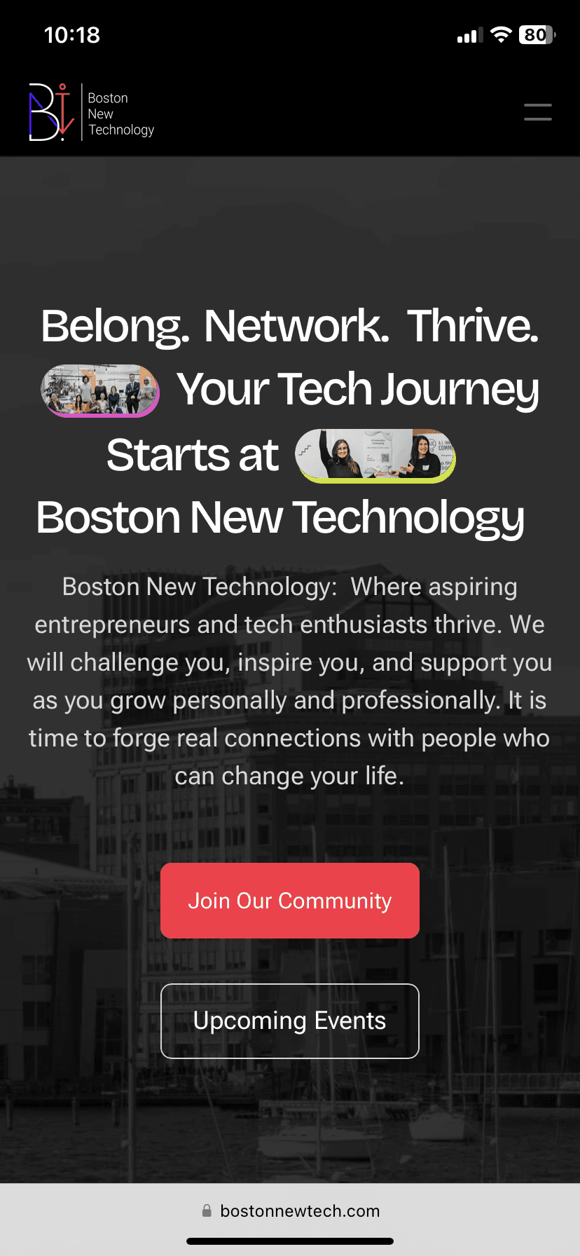
As a volunteer, I saw the opportunity to redesign the BNT website, a not-for-profit startup, technology, and business community of 28k professionals. Their mission is to help startups and local businesses launch and grow. The current website was outdated, content-heavy, and not user-friendly. Stakeholders wanted a revamp to make it modern and user-friendly. Given BNT's limited resources, we used Framer to design and launch the site. This project was a perfect opportunity to apply my UX/UI knowledge and skills.
DURATION

4 months

RESPONSIBILITIES
Visual Design, UX Design, Prototyping, Usability testing.
TOOLS

Figma, Miro, Framer

DURATION

4 months

RESPONSIBILITIES
Visual Design, UX Design, Prototyping, Usability testing.
TOOLS

Figma, Miro, Framer

DURATION

4 months

RESPONSIBILITIES
Visual Design, UX Design, Prototyping, Usability testing.
TOOLS

Figma, Miro, Framer

DURATION

4 months

RESPONSIBILITIES
Visual Design, UX Design, Prototyping, Usability testing.
TOOLS

Figma, Miro, Framer

Here's a 1 min TL;DR version.

My Role

UX Lead — Interaction Design, Visual Design, User Flows, Rapid Prototyping

Why was it done?

The BNT website was outdated and content-heavy, making it difficult for users to navigate and find relevant information. This hindered user engagement and community growth.

What were the constraints?

The project needed to be completed within a 3-month timeline with a small team of 3 members, We were required to use Framer to implement the designs.

What impact did it have?

Significantly improved user metrics and feedback

What did I learn?

I experienced the excitement of working at a startup that launches other startups. I valued direct conversations with stakeholders for understanding needs and feedback.

Before

798

Unique visitors increased to 798 in the first 30 days.

1.7K

Increased to 1.7K page views in the first 30 days

25%

Higher participation in community events.

798

Unique visitors increased to 798 in the first 30 days.

1.7K

Increased to 1.7K page views in the first 30 days

25%

Higher participation in community events.

798

Unique visitors increased to 798 in the first 30 days.

1.7K

Increased to 1.7K page views in the first 30 days

25%

Higher participation in community events.

798

Unique visitors increased to 798 in the first 30 days.

1.7K

Increased to 1.7K page views in the first 30 days

25%

Higher participation in community events.

798

Unique visitors increased to 798 in the first 30 days.

1.7K

Increased to 1.7K page views in the first 30 days

25%

Higher participation in community events.

01 Home Screen

Video Loop

01 Home Screen

Video Loop

03 Mobile Screens

Video Loop

02 Mobile Screens

Images

02 Mobile Screens

Images

02 Mobile Screens

Images

02 Mobile Screens

Images

PROBLEM
PROBLEM
PROBLEM
PROBLEM
The current Boston New Technology (BNT) website faces several challenges that hinder its effectiveness

Too many pages options -> overwhelmes user and

makes it difficult to focus or find targeted page ->

Can lead to leaving site

Poor Logo -> Outdated -> makes it feel like an old brand

-> Good design = good business

Some page name does not make sense at first unless you visit those pages

Videos of events? BNT? or anything else?

Is this a list of startups?

what is the purpose of this list?

Poor Logo -> Outdated -> makes it feel like an old brand

-> Good design = good business

Some page name does not make sense at first unless you visit those pages

Videos of events? BNT? or anything else?

Is this a list of startups?

what is the purpose of this list?

Too many pages options -> overwhelmes user and

makes it difficult to focus or find targeted page ->

Can lead to leaving site

Drop Down

Dropdown menus are not clearly indicated, which may cause users to overlook additional content

Drop Down

Dropdown menus are not clearly indicated, which may cause users to overlook additional content

Drop Down

Dropdown menus are not clearly indicated, which may cause users to overlook additional content

Drop Down

Dropdown menus are not clearly indicated, which may cause users to overlook additional content

Drop Down

Dropdown menus are not clearly indicated, which may cause users to overlook additional content

Event Details Card

The visual presentation of events lacked consistency and impact, with event listings often appearing cluttered and not visually appealing

Event Details Card

The visual presentation of events lacked consistency and impact, with event listings often appearing cluttered and not visually appealing

Event Details Card

The visual presentation of events lacked consistency and impact, with event listings often appearing cluttered and not visually appealing

Event Details Card

The visual presentation of events lacked consistency and impact, with event listings often appearing cluttered and not visually appealing

Event Details Card

The visual presentation of events lacked consistency and impact, with event listings often appearing cluttered and not visually appealing

Old site Issues:

Information Overload.

Poor User Experience (UX) Design

Ineffective Use of Multimedia Elements

Inconsistent Branding and Design

Old site Issues:

Information Overload.

Poor User Experience (UX) Design

Ineffective Use of Multimedia Elements

Inconsistent Branding and Design

Old site Issues:

Information Overload.

Poor User Experience (UX) Design

Ineffective Use of Multimedia Elements

Inconsistent Branding and Design

Old site Issues:

Information Overload.

Poor User Experience (UX) Design

Ineffective Use of Multimedia Elements

Inconsistent Branding and Design

OPPORTUNITY
OPPORTUNITY
OPPORTUNITY
OPPORTUNITY
How might we better organize the content so that users feel motivated to learn about the website?
To better organize the content and motivate users to learn about the BNT website, we will implement a user-centric design approach that prioritizes clarity and ease of navigation. Key resources and upcoming events will be prominently featured on the homepage, using visually engaging elements such as banners and highlighted sections. A simplified and intuitive navigation bar will allow users to effortlessly access different parts of the website,

GOAL

GOAL

GOAL

To create an experience that not only makes accessing information effortless and intuitive but also vividly showcases the vibrant community and abundant opportunities that BNT offers.

To create an experience that not only makes accessing information effortless and intuitive but also vividly showcases the vibrant community and abundant opportunities that BNT offers.

NORTH STAR DESIGN PRINCIPLES

Concise Clarity

Ensure the experience is straightforward and intutive

User - Centricity

Design with the end-user's needs, emotions, and behaviors.

Authentic and Engaging

Create an experience that reflects the BNT's values.

NORTH STAR DESIGN PRINCIPLES

Concise Clarity

Ensure the experience is straightforward and intutive

User - Centricity

Design with the end-user's needs, emotions, and behaviors.

Authentic and Engaging

Create an experience that reflects the BNT's values.

NORTH STAR DESIGN PRINCIPLES

Concise Clarity

Ensure the experience is straightforward and intutive

User - Centricity

Design with the end-user's needs, emotions, and behaviors.

Authentic and Engaging

Create an experience that reflects the BNT's values.

NORTH STAR DESIGN PRINCIPLES

Concise Clarity

Ensure the experience is straightforward and intutive

User - Centricity

Design with the end-user's needs, emotions, and behaviors.

Authentic and Engaging

Create an experience that reflects the BNT's values.

USER RESEARCH
USER RESEARCH
USER RESEARCH
USER RESEARCH
Understanding our Users
On approaching this problem, it was important to understand how BNT users navigate and find information. We conducted in-depth user research involving interviews with stakeholders, individual users, and members of the BNT community.
Affinity Diagram
Affinity Diagram
Affinity Diagram
Affinity Diagram
Affinity Diagram
I then began to map our observations from user interviews in order to pinpoint the underlying common themes and specific needs. I constructed the affinity diagram below. As i presented this to my team, what really stood out was the Boston New Technology has amazing content, tons of useful resources. but its just not organized properly This comprehensive understanding of our users' experiences and expectations guided the design and development process.
USER RESEARCH TAKEAWAYS
Key Findings
Key Findings
Key Findings
Key Findings
Key Findings
From our research, it became evident that users prioritize clear navigation, timely event updates, and a modern, user-friendly interface on the BNT website. These insights guided our strategy for redesigning the website to better serve the needs of our diverse user base.
USERFLOWS AND INFORMATION ARCHITECTURE (IA)
Seamless Access to Essential Information.
To create an effortless and intuitive way for users to get the information they need, I simplified navigation and improved clarity. Visitors often missed crucial information due to a complex navigation structure and ineffective CTAs. I addressed this by redesigning the navigation bar and enhancing call-to-actions.

Articles & Blogs

Community

Gallery

Home

Menu

Featured Events

Testimonials

News Letter

CTA

About

Events & Programs

Resources

Contact

Join our community

Upcoming Events

Programs

Become a member

Become a sponsor

Articles & Blogs

Community

Gallery

Home

Menu

Featured Events

Testimonials

News Letter

CTA

About

Events & Programs

Resources

Contact

Join our community

Upcoming Events

Programs

Become a member

Become a sponsor

Articles & Blogs

Community

Gallery

Home

Menu

Featured Events

Testimonials

News Letter

CTA

About

Events & Programs

Resources

Contact

Join our community

Upcoming Events

Programs

Become a member

Become a sponsor

Articles & Blogs

Community

Gallery

Home

Menu

Featured Events

Testimonials

News Letter

CTA

About

Events & Programs

Resources

Contact

Join our community

Upcoming Events

Programs

Become a member

Become a sponsor

BRAINSTORMING
BRAINSTORMING
BRAINSTORMING
BRAINSTORMING
Exploring Solutions.

Time to dive into the wild world of brainstorming. Picture this: a room full of creative minds, sticky notes flying like confetti, and enough coffee to power a small city. Here’s how we tackled the next step of our journey.

Time to dive into the wild world of brainstorming. Picture this: a room full of creative minds, sticky notes flying like confetti, and enough coffee to power a small city. Here’s how we tackled the next step of our journey.

Time to dive into the wild world of brainstorming. Picture this: a room full of creative minds, sticky notes flying like confetti, and enough coffee to power a small city. Here’s how we tackled the next step of our journey.

Time to dive into the wild world of brainstorming. Picture this: a room full of creative minds, sticky notes flying like confetti, and enough coffee to power a small city. Here’s how we tackled the next step of our journey.

Time to dive into the wild world of brainstorming. Picture this: a room full of creative minds, sticky notes flying like confetti, and enough coffee to power a small city. Here’s how we tackled the next step of our journey.

Step 1: Setting the Stage

First things first, we gathered our team of designers, content, Marketing Team and Stakeholders. Everyone was up to speed on the key themes from our user research: navigation nightmares, content chaos, and the elusive event visibility.

Step 2: Idea Storming

We kicked things off with some good old-fashioned mind mapping. The whiteboard became our battlefield, and sticky notes were our weapons of choice. No idea was too wild or too weird.
We evaluated each idea based on feasibility, impact, and how likely it was to make our user's lives easier (and our bosses happy).

Step 3: Low - Fidelity Mockups

Home Page

Nav Bar

BNT

Tagline for BNT /

A compelling reason to attract entrepreneurs

Become a member CTA

What do we do?

Entrepreneurship

Short description of what this means Short description of what this means

Entrepreneurship

Short description of what this means Short description of what this means

Entrepreneurship

Short description of what this means Short description of what this means

Why should you be a part of BNT?

Mentoring

Some Description

Mentoring

Some Description

Mentoring

Some Description

A sneak peek, upcoming events in BNT

Thursday, March 21, 12:00PM

Precision Pitch Training

“Lorem Ipsum is simply dummy text of the printing and typesetting industry. Lorem Ipsum has been the industry's standard dummy text ever since the”

Checkout the event

Community Wins: Success with BNT

John Smith

Startup Name, Founder

“Lorem Ipsum is simply dummy text of the printing and typesetting industry. Lorem Ipsum has been the industry's standard dummy text ever since the 1500s, when an unknown printer took a galley of type and scrambled it”

Footer

About Page

Nav Bar

Boston New Technology

Catchy phrase about BNT

2 line introduction / mission statement

Our History

Spanning for over 10 years ....etc etc Lorem Ipsum is simply dummy text of the printing and typesetting industry. Lorem Ipsum has been the industry's standard dummy text ever since the

Spanning for over 10 years ....etc etc Lorem Ipsum is simply dummy text of the printing and typesetting industry. Lorem Ipsum has been the industry's standard dummy text ever since the

Spanning for over 10 years etc etc Lorem Ipsum is simply

Spanning for over 10 years etc etc Lorem Ipsum is simply

Spanning for over 10 years etc etc Lorem Ipsum is simply

Spanning for over 10 years etc etc Lorem Ipsum is simply

Spanning for over 10 years etc etc Lorem Ipsum is simply

How can we help you?

Lorem Ipsum is simply dummy text of the printing and typesetting industry. Lorem Ipsum has been the industry's standard dummy text ever since the Lorem Ipsum is simply dummy text of the printing and typesetting industry.

Point 1

Point 2

Point 3

Point 4

Testimonials

How did we help others? Give some instances / founders testimonials of how BNT helped them

Our values

4 pillars - Inclusion, Inspiration, Education, Empowerment

Footer

Events Page

Nav Bar

Events and Programs

Catchy phrase about Events

2 line introduction / mission statement

Event Calendar

Explaination of why we do events - statement about it followed by


about startup showcases - describe


fireside chats - podcasts interviews from industry


startup weekend


What to expect at events - vibe, experience, testimonials, pictures


Event name

Date & Time

Location

Event name

Date & Time

Location

Event name

Date & Time

Location

Events and Programs

Footer

DESIGN DECISIONS
DESIGN DECISIONS
DESIGN DECISIONS
DESIGN DECISIONS
Simplifying the complex Home Screen by making it clear and accessible [+Enjoyable ]

We host Precision Pitch Training on every Thursday - Join Now!

Home

About

Events & Programs

Resources

􀆉

Contact

Join us

Belong.

Network.

Thrive.

Your Tech Journey

Starts at

Boston New Technology ✨

A vibrant community where aspiring entrepreneurs and tech enthusiasts thrive. A community of like-minded individuals who will challenge you, inspire you, and support you as you grow personally and professionally. Forge real connections with people who can change your life.

Join Our Community

Upcoming Events

A 10+ Years of Fostering Innovation

We connect you with the people and resources you need to turn your ideas into reality.

Need a Buzz?

Get your startup in front of hundreds of potential customers and investors at our famous showcase events.

Feeling Lost?

Learn from inspiring talks, workshops, and discussions led by industry experts.

Stuck?

Connect with mentors, co-founders, and collaborators who can help you solve problems and take your business to the next level.

Word on The Street: BNT Can’t Be Beat

Stay informed, equipped, and supported in one of New England's oldest tech ecosystems.

“I am continually impressed by the passion and knowledge thriving within BNT.”

It's an inspiring environment for anyone interested in cutting-edge technology. Everyone I've encountered in this vibrant community has been exceptionally welcoming and supportive. Providing a platform and a means of access, BNT has pioneered what it means to build community.

John Carter

CEO at Webflow Agency

“Met a lot of innovative people, made great connections”

Ut enim ad minim veniam, quis nostrudexercitation ullamco laboris nisi ut aliquip ex ea commodo consequat aute irure sint amet occaecat cupidatat non proident”

John Carter

CEO at Webflow Agency

Featured Events
22

APR

MON, APR 22, 2024, 5:00 PM EDT

Food As Medicine, Food As Community

Event Details
24

APR

MON, APR 24, 2024, 5:00 PM EDT

TC Side Event: Pitch Practice


Event Details

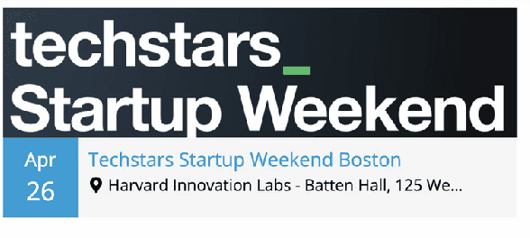
28

APR

techstar_

Startup Weekend

Boston

MON, APR 26, 2024, 6:00 PM EDT

Techstars Startup Weekend Boston

Event Details

All Events and Programs

We're not just a Tech Community!
We help you fuel your Innovation. Ignite your Growth 🚀

10+ years fostering innovation and building connections

Unrivaled Networking Opportunities

BNT offers access to a thriving network of tech enthusiasts, entrepreneurs, investors, and industry leaders, facilitating invaluable connections that fuel collaboration and success.

Exclusive Access to Resources and Events

Members gain entry to a wide range of events, including expert-led workshops, pitch nights, and seminars, all designed to elevate your startup journey and catalyze growth.

Community and Collaboration

Our inclusive and supportive environment unites startups and tech enthusiasts, fostering a culture of innovation where collaboration propels us forward.

Tailored Mentorship and Support

With personalized guidance from experienced entrepreneurs and business experts, BNT ensures you receive the mentorship and support needed to navigate the startup landscape successfully.

Check Our Programs

BNT Community Voices

“Boston New technology is the best”

Ut enim ad minim veniam, quis nostrudexercitation ullamco laboris nisi ut aliquip ex ea commodo consequat aute irure sint amet occaecat cupidatat non proident”

John Carter

CEO at Webflow Agency

“Boston New technology is the best”

Ut enim ad minim veniam, quis nostrudexercitation ullamco laboris nisi ut aliquip ex ea commodo consequat aute irure sint amet occaecat cupidatat non proident”

John Carter

CEO at Webflow Agency

“Boston New technology is the best”

Ut enim ad minim veniam, quis nostrudexercitation ullamco laboris nisi ut aliquip ex ea commodo consequat aute irure sint amet occaecat cupidatat non proident”

John Carter

CEO at Webflow Agency

Our Four Core Values

Inclusion

We welcome every voice, including yours.

Inspiration

Igniting the Spark of Possibility In You

Education

Critical Sources Of Knowledge and Mentorship

Empowerment

Your Empowerment Is Our Main Objective

This could be you

These Organizations Love Working With Us

In case you're wondering what that empty spot signifies…it's you! (Yes, we're that Crafty)

Go Beyond with BNT

Our monthly newsletter keeps you informed, entertained, and in the know!

Your email ID

Sign up

© 2021 Boston New Technology.  All Rights Reserved.

BNT @ QUBIC LABS, 1200 Hancock St, Quincy, MA 02169

Added Announcements Bar

Reorganized the Menu Items

Primary and Secondary Call - to- actions

Highlighting BNT’s Impact and Offerings

Featured Events

Simplified secondary call - to- actions

core benefits of being part of the
BNT community

Testimonials

Core Values

Partners Section

Newsletter

Improved Footer with
social links

This area highlights how we connect users with the people and resources needed to turn ideas into reality

highlights key events that foster community engagement, learning, and networking within the BNT ecosystem

To make users focus on the most important ones

showcasing our commitment to supporting innovation, providing valuable resources, and fostering a collaborative environment.

highlighted testimonials from our community. This section features feedback from satisfied users, emphasizing the value and support BNT provides.

showcasing the strong network

latest updates from BNT by subscribing to newsletter

This section aims to build trust and credibility by showcasing real user experiences

The primary CTA, "Join Our Community," and the secondary CTA, "Upcoming Events," are strategically placed to guide users towards engaging with the community and exploring events.

Redesigned Home Screen

Image

VISUAL DESIGN
VISUAL DESIGN
VISUAL DESIGN
VISUAL DESIGN
Building a new style guide based on existing BNT brand guidelines.

Primary Button

6px

18 px

20

54

18

20

18

24

APR

MON, APR 24, 2024, 5:00 PM EDT

TC Side Event: Pitch Practice

Event Details

257

68

60

4

16

368

16

12px

Font Pairing

Bricolage Grotesque + Roboto

Boston New Technology

Boston New Technology is a not-for-profit startup technology, and business community of 28k professionals, whose main mission is to help startups and local businesses launch and grow!

Style Guide

Image

TESTING AND IMPROVEMENTS
Making improvements based on feedback.
we conducted extensive user testing sessions. These sessions involved both existing users familiar with the BNT platform and new users experiencing it for the first time. Most suggestions focusing on content-related improvements rather than significant usability issues.
Responsive Design.
Responsive Design.
Responsive Design.
Responsive Design.
Responsive Design.
Following the initial redesign and testing phase, we were tasked with ensuring the website's usability across various devices. The designs initially included only the desktop version, so I had to create responsive versions in Framer.

This is the home screen of the Boston New Technology website

This is the home screen of the Boston New Technology website

Each team member's role and contribution are highlighted to give users a better understanding of the people behind the organization

Each team member's role and contribution are highlighted to give users a better understanding of the people behind the organization

An integrated event calendar powered by Notion, making it easy for users to search for and filter upcoming events.

An integrated event calendar powered by Notion, making it easy for users to search for and filter upcoming events.

Mobile Screens

Image

REFLECTIONS
REFLECTIONS
REFLECTIONS
REFLECTIONS
Results & Reflection.
After collaborating closely with stakeholders and the team to bring our designs to life using Framer, we navigated the typical challenges of a startup environment—unexpected hurdles and delays. Launching the test version of the website, we aimed for higher engagement and improved user satisfaction.


Our efforts paid off. Within the first 30 days, website traffic doubled to 798 visitors. We saw a 28% increase in navigation menu clicks, a 10% rise in newsletter signups, and a 25% boost in community event participation.

After collaborating closely with stakeholders and the team to bring our designs to life using Framer, we navigated the typical challenges of a startup environment—unexpected hurdles and delays. Launching the test version of the website, we aimed for higher engagement and improved user satisfaction.

Our efforts paid off. Within the first 30 days, website traffic doubled to 798 visitors. We saw a 28% increase in navigation menu clicks, a 10% rise in newsletter signups, and a 25% boost in community event participation.
After collaborating closely with stakeholders and the team to bring our designs to life using Framer, we navigated the typical challenges of a startup environment—unexpected hurdles and delays. Launching the test version of the website, we aimed for higher engagement and improved user satisfaction.


Our efforts paid off. Within the first 30 days, website traffic doubled to 798 visitors. We saw a 28% increase in navigation menu clicks, a 10% rise in newsletter signups, and a 25% boost in community event participation.

Project Takeaways:
Project Takeaways:
Project Takeaways:
Project Takeaways:
Project Takeaways:

Finding opportunities within constraints

Cross-functional teams should be involved from the start

Simplicity was about reducing complexity, not quantity

Leveraging existing resources